


Special Edition Review: Daphne Press Sabriel by Garth Nix
- Story Eater

- Aug 13, 2022
- 5 min read

Hold onto your seats, bookish folk, I’m going to be incredibly nitpicky with a small amount of snark for this one. Daphne Press' inaugural offering of Garth Nix's Sabriel was £75 (~$91), without shipping, which is about the cost of a special edition from other book printers such as The Folio Society and Easton Press, but it doesn't quite measure up to the price for me. (For comparison, a nice edition of Dune from Easton is $90 and from The Folio Society is £95)

For reference purposes, I will post the description of the original announcement post for the book from November 2021, along with the current description of it from the illumicrate website, quoted.
Book features from IC Instagram Page, 18 Nov 21 (Accessed 10 Aug 22):
The book will be bound with an all new, exclusive wraparound cover, illustrated by the talented @tommyarnoldart! It will include a foreward from the author and 25th anniversary bonus content, including the short story 'One Wyverley Summer.' Each book will be housed in a leather textured slipcase (faux) with a gold foil charter symbol on both sides, and signed on a full colour page featuring the original Sabriel cover art by Leo & Diane Dillon. It will have a ribbon marker and colored endpapers featuring Sabriel’s bells art by Gavin Reece.*
The IC Daphne Press page, (Accessed 10 Aug 22)
Includes additional info: “The interior pages are College Text FSC paper (acid free) and the hardback case is Masterblank Blanco paper (acid free).”*
*italics added
Sabriel, the first book in The Abhorsen Trilogy by Garth Nix, is one of my all-time favorite books. It’s securely positioned in my top ten favorites. I have several editions of it, including the 25th Anniversary Editions from both Allen & Unwin and HarperTeen. Each edition has separate special inclusions: the HarperTeen includes the bonus story “One Wyverley Summer” as well as an excerpt from both Lirael and Terciel and Eleanor, and the Allen & Unwin edition includes an afterword from the author along with really cool images of handwritten drafting, drafting notes, and word count tracks with dates.

For the brightest note, the Daphne Press edition of Sabriel comes with a modified version of a combination of all bonus content from both 25th Anniversary editions, though the letter from the Allen & Unwin edition has been modified slightly in the middle paragraphs, and the pictures are not fit onto one page each but condensed to 3-5 per page. I’ll say I’m pretty pleased with being able to get most of the bonus content in one edition, though as a collector, I’m not happy unless I have every jot and tittle from all of them. I’m a bit neurotic, though. 4/5 stars for the bonus content. Though, I feel the photographic bonus content could have been put one image to a page with some descriptive captions to make it look more professional and give it a higher-quality feel. Four extra blank pages sit the end of the book, so those could have been utilized rather than left blank, certainly.


Now, for the outside of the book. This is where I get a bit snarky. The foil charter mark on the case wrap is beautiful. It looks very old and worn, like it was written on a rocky surface long ago in the Old Kingdom. It’s a nice detail; however, mine came with some scratches on it, though it was shrink-wrapped in plastic. Additionally the “leather textured slipcase (faux)” is literally paper, not faux leather. I realize the description did not say that it was something other than just paper, but the wording on the advert is a bit deceptive. My slip case came in pretty good condition, with all but one corner on it nice and square (which is how orders for new books should arrive). I don’t think the other corner is a shipment or packing ding, though. I think it’s just wrapped wrinkly, which is still not good, but at least it’s not dinged.


The endpapers are fabulous. I would have preferred the bells to be in foil, though, for the price. A closer look at the full-color tip in for the signature page shows that it’s a bit smaller than the pages in the book, and it was glued in. My opinion is that it should have been bound in. As it is, one cannot look at the tip in without having to do page flipping acrobatics and try to get the pages apart to actually view the signature page without bending or folding them because they are neither lined up well nor the same size. For those who plan to purchase a copy or have already done so but not opened the book properly, be sure to follow proper new book opening protocol when opening the book. I do not think the binding can handle a cold front cover open without it being babied. I have also seen at least one picture from someone who purchased a copy with the glue from the endpapers coming apart from the signature page, so I feel it wise to take care and check to see if yours has this damage. Mine does not have this, thank goodness.


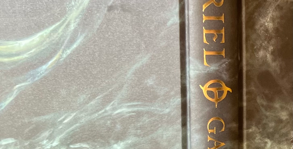

On to my biggest complaint. The case wrap. The art is spectacular; I love seeing art for the ninth gate on the cover, with Mogget (oh, I how I love Mogget) on the back cover, lurking as usual in the shadows. I also love that it is matte and not shiny, which is atrocious and shows fingerprints. Yuck. What I absolutely do not like is the quality of the casewrap paper. First of all, it’s thin paper, and the corners of it, including the spine, are wearing away and there is a scuff (not a smudge, which I initially thought) on the back cover—all there before I even pulled it out of the slip case. And my edition is not the only copy with this problem. A £75 book that is brand new should not have scuffing on the case wrap. At all. This leads me to believe that the ink used to print it is cheap, the paper is cheap, or both are cheap. Casewraps from even normal trade editions do not have this problem. This very expensive edition should not have this problem. In addition to the scuffing on the corners of the wrap, it appears as though the title and author on my spine slightly veer off center toward the bottom. Oh, and the ribbon is rinky-dink. It’s about 1/8” thick and already frayed at the end.
Overall, 3/5. All of this sounds quite persnickety, and if I had only paid £20 or £30 for the book, I wouldn’t be so critical. This edition was £75. That’s $91 US. Before shipping. I don’t think the quality is there for the price. Though the 25th Anniversary Edition from Allen & Unwin was almost $40 for me, including shipping (though Book Depository sent it IN AN ENVELOPE and it got pretty dinged up, and it had no slipcase), I feel it is a better edition. The binding is nice and tight, the spine, cover, and corners aren’t scuffed, it’s centered, the cover art is on matte paper but it’s a thick, nice paper with a bit of texture and sheen to it, and the bonus content is one image to a page. As it is, I’m not quite sure I’ll continue to purchase Daphne Press editions of books if the quality is like it is for this selection. I may get one more to see if there is an improvement in quality, but if not, I’ll probably seek out other special editions in this price range that I know will bring me better bang for my buck.
£75 and no sewn binding?! What a rip-off.